Snooze Panda
Graphic Design II + Winter 2024 + Branding Identity
Introducing Snooze Panda, a new brand that values the impact of a good night’s sleep on overall well-being. In today’s fast-paced world, where exhausting days are common, we’ve curated a range of products to enhance your sleep experience.
Our offerings create a tranquil sleep environment, promoting deep, restorative rest that leaves you feeling refreshed each morning. From luxurious bedding to soothing ambient lighting, our products relieve stress and cultivate peace of mind, ensuring you wake up ready to tackle the day with renewed energy and clarity.
With Snooze Panda, enjoy the sleep you deserve.
Branding Identity
Case study
Packaging Design
Website develoment
THE MISSION
What is Brand’s goal? The brand goal is to improve the overall quality of sleep for young professionals who had exhausting day everyday. They seek products that contribute to a deeper, more restorative sleep, leaving them feeling refreshed and rejuvenated in the morning. Using Snooze Panda products to create a tranquil sleep environment that helps relieve stress and promotes a peaceful state of mind.
To achieve this, I focus on creating visually appealing designs that draw the attention of young professionals seeking comfort and tranquility. I develop user-friendly collateral to effectively promote my brand and its offerings, ensuring accessibility and ease of use for our customers.
LOGO
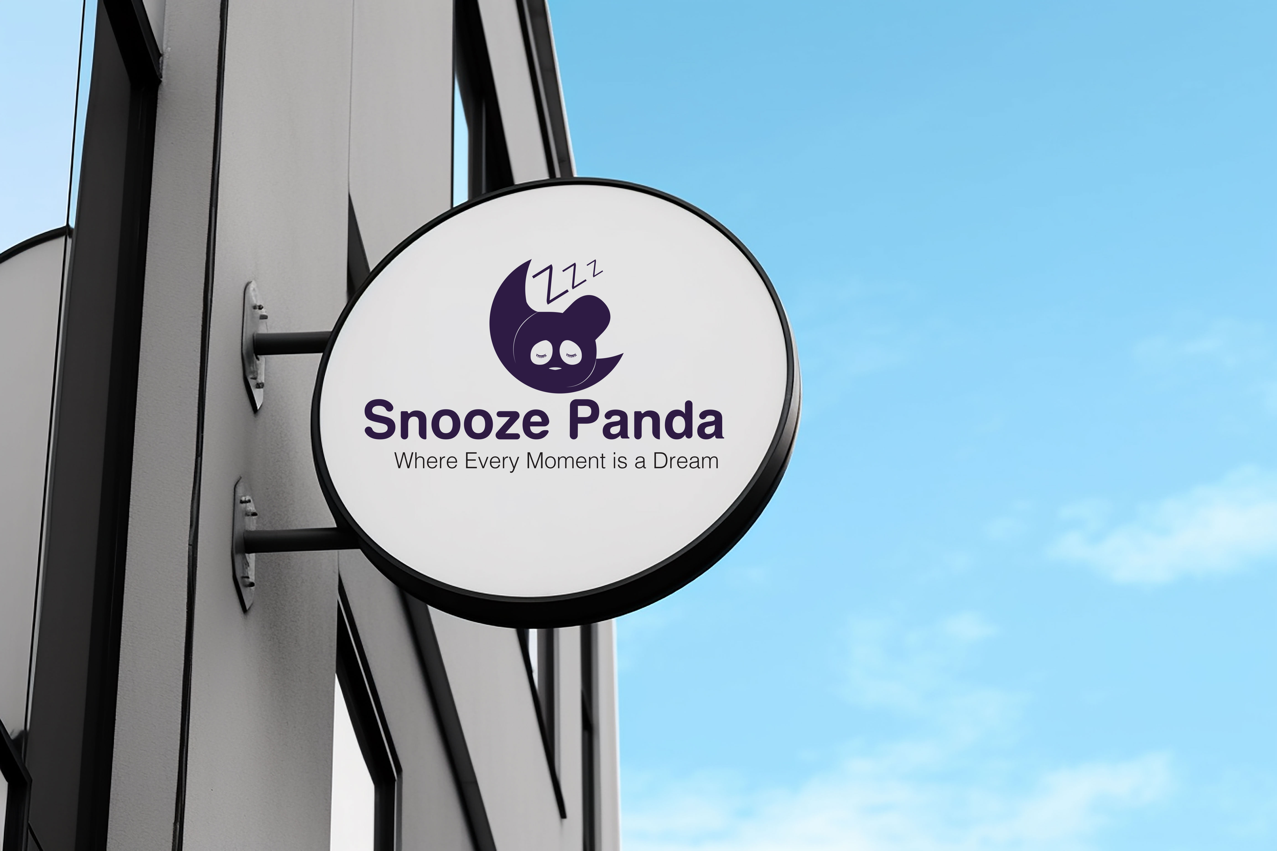
For the Snooze Panda logo, I blended the moon and panda and the snooze sign Zzz to show that we’re all about sleep essentials. The moon represents nighttime and sleeping, while the panda is our brand symbol. I used our main font, Lato, but made it a bit rounder to match the panda’s style. This logo aims to capture what Snooze Panda is all about and connect with our customers.
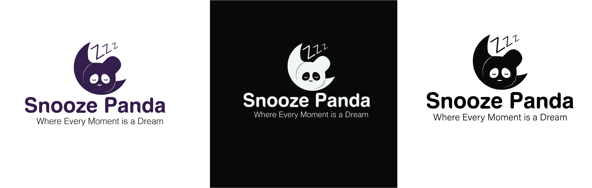
Snooze Panda has three logos, each serving a different purpose. In the following slides, I’ll discuss the process behind creating each logo and the function it serves for our brand.
LOGO PROCESS
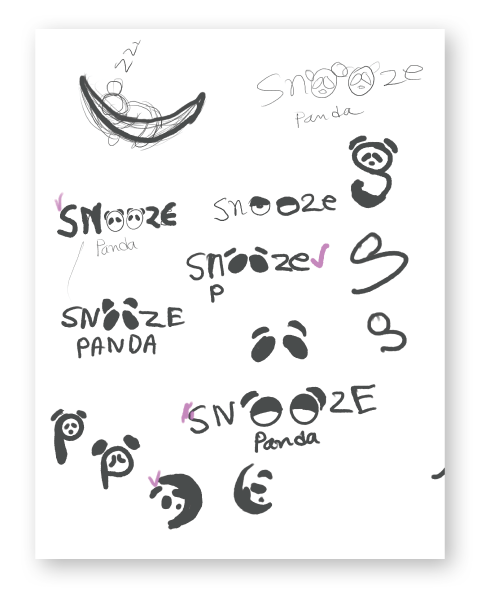
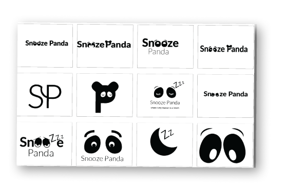
Initially, I brainstormed various ideas for the Snooze Panda logo, considering options like a typographic design with simple eye shapes representing the “O” in “Snooze” or incorporating the brand initials as a mark. However, after numerous sketches, I settled on an iconographic approach featuring a combination of a moon, panda, and “Zzz” symbols to encapsulate the essence of the brand without needing the name. This design communicates the brand’s focus on sleep even at a glance.
Additionally, I incorporated custom typography using the Lato Font for the brand name to ensure consistency and readability while the slogan is in a regular font.

LOGO VARIATIONS
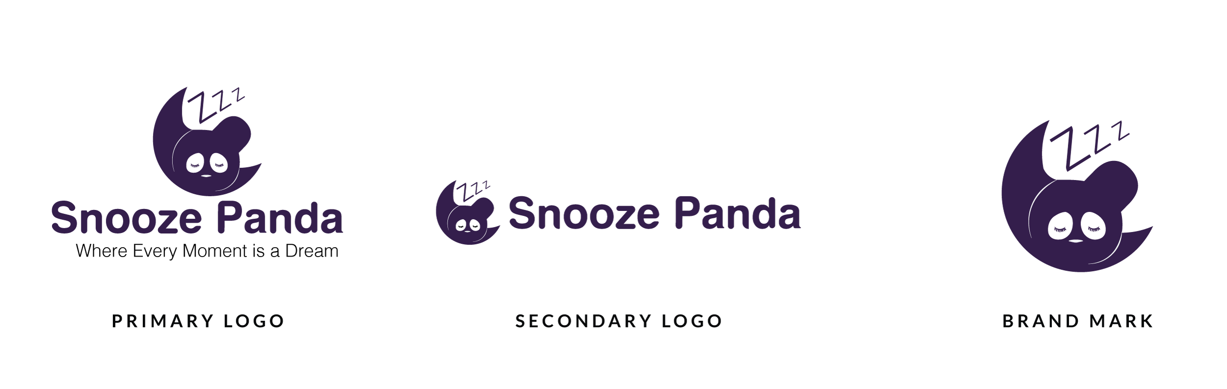
Snooze Panda's branding features three distinct logo variations to maintain consistency and flexibility across different applications. The primary logo is the most recognized, featuring a combination of a moon, panda, and “Zzz” symbols to evoke feelings of comfort and relaxation. It is used widely, from signage to packaging, and can include or exclude the brand name and slogan. The secondary logo is a simplified, horizontally oriented version, often used where space is limited, such as on shopping bags and website footers, focusing on the brand name or icon alone. Lastly, the brand mark is a compact monogram of the main logo, designed for print materials and products, ensuring that Snooze Panda’s identity is communicated effectively even in smaller or more discreet applications.
COLORS
At Snooze Panda, every aspect of the brand is designed with comfort and relaxation in mind. That’s why I chose a soft and soothing color palette, centered around the calming tones of lavender. Lavender has long been associated with promoting restful sleep and tranquility, making it the perfect choice to help you unwind and drift off into a peaceful slumber.
I believe that your sleep environment should be as cozy and inviting as possible, and my color scheme reflects our commitment to creating a haven of comfort for our customers.

TYPOGRAPHY
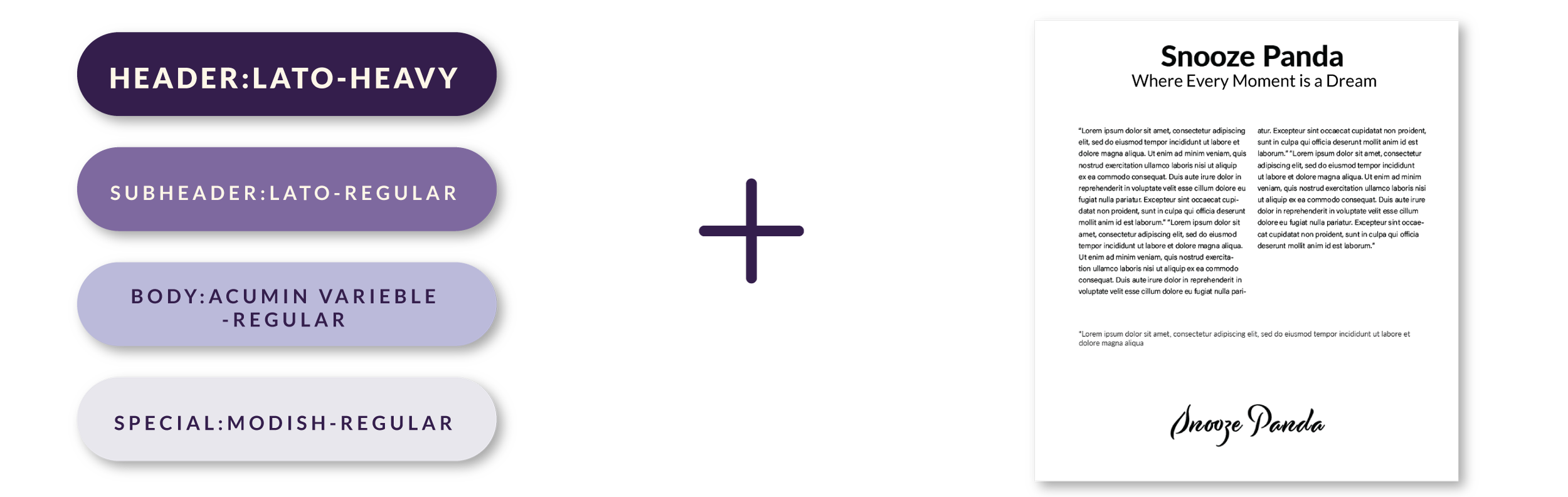
I chose the sans-serif font because it communicates simplicity, readability, modernity, and versatility, which are crucial for engaging with our audience effectively. This font helps people easily understand our message and feel relaxed. Specifically, I selected Lato and Acumin Variable for their unique qualities and ability to enhance the overall aesthetic of our brand.
I also chose a script font called Modish for special uses within our brand. Its elegant and flowing style adds a touch of sophistication and personality to specific elements, creating a memorable and distinctive visual identity.
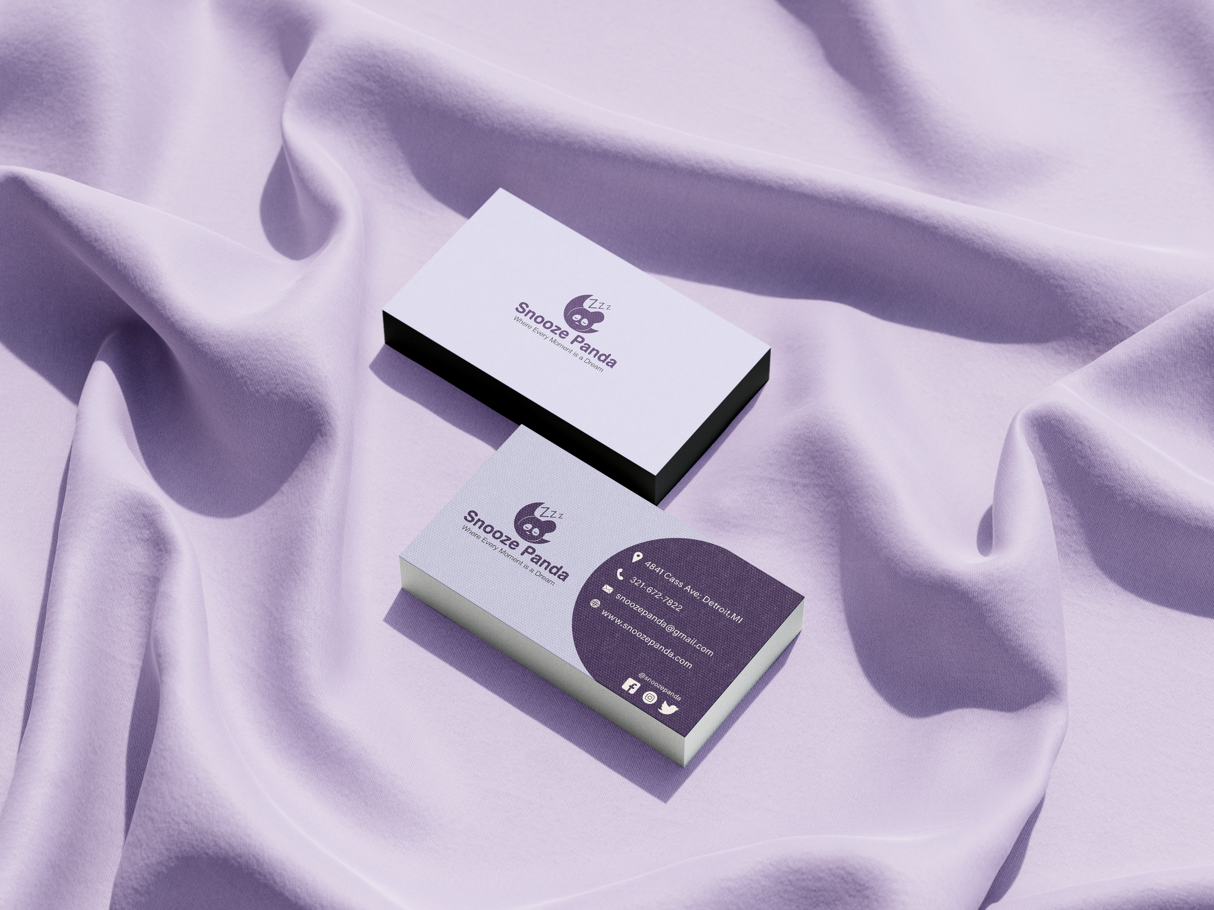
COLLATERAL
I carefully create all of Snooze Panda’s materials to make sure our brand looks the same everywhere. Our business cards have our logo and contact info in our brand colors. The shopping bags I design have our logo name and assets print on them, so you know it’s us. I make brochures that tell you all about our brand and why our sleep products are great. And I always say thank you to our customers with special cards. Everything, from our shipping boxes for safe delivery to our website, has the same look, so you always know it’s Snooze Panda. I even make sure our essential oil packages have window so you can see what’s inside and candle jars look just right. And I edited stock pictures to match our brand style. I want every piece of our collateral to show that they all belongs to the brands.


THE OUTCOME
I’ve taken great care in crafting Snooze Panda’s brand image to ensure it’s impactful and meaningful. Our brand’s physical collateral is designed to evoke feelings of coziness, cleanliness, and comfort, appealing to a diverse audience. It strikes the right balance between comfort and sophistication, drawing in young professionals and others too.
Additionally, I’ve developed a landing page for the website of Snooze Panda that allows us to showcase our services and promotions online. Through thoughtful design and creativity, I’ve brought this brand to life, ensuring that every aspect reflects our values and resonates with our customers.