
The Art of Typeface

This book documents the creative process of designing six distinct typefaces. Each iteration represents a different approach to typographic design, exploring form, structure, and the use of grid systems. The book reflects a comprehensive study of type design, focusing on both creative experimentation and the establishment of clear rules for each typeface.
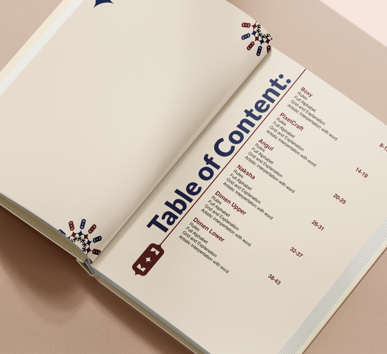
Boxy
Pixel Craft


TYPEFACES USED WITHIN THIS BOOK
Angul
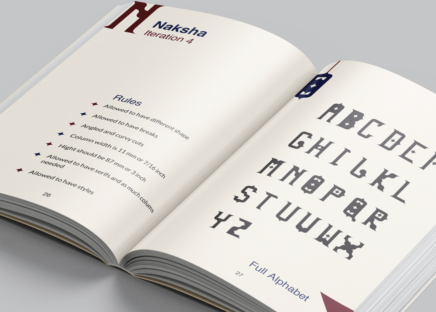
Naksha
Dimen Upper
Dimen Lower

Each typeface includes the following components:
Design Rules: Guidelines for creating each typeface.
Full Alphabet: The complete set of characters designed for each typeface.
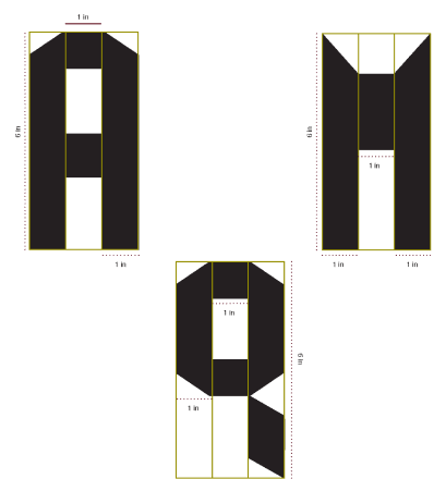
Grid Explanation: The grid structure used to maintain consistency in design.
Artistic Interpretation: A creative word representation to visually showcase the typeface's character.


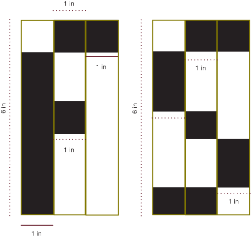
BOXY
Concept: Basic typeface creation warm-up using a two-column grid.
Artistic Interpretation: Expresses "Life is Short, Smile while you still have teeth," reflecting the typeface's straightforward nature.


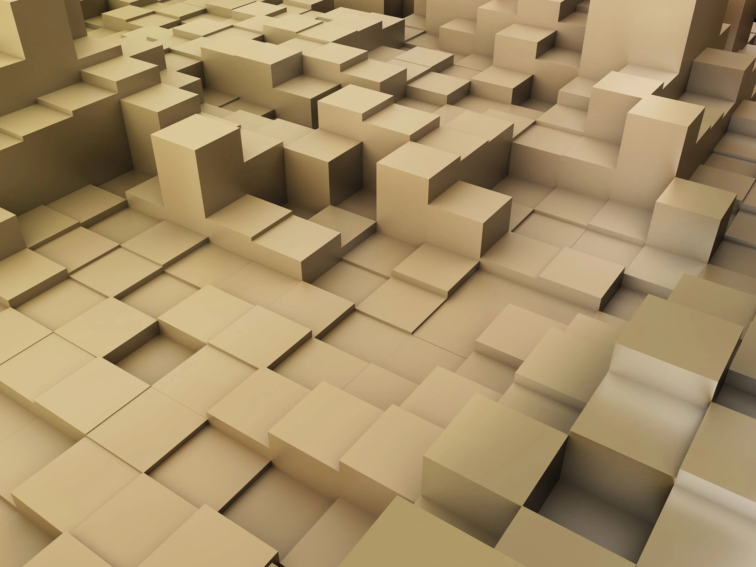


Concept: Inspired by blocky or pixelated typefaces, reminiscent of Minecraft.
Outcomes: The increased flexibility of three columns allowed for more recognizable letterforms, making it easier to create familiar shapes within the grid structure.
PIXELCRAFT
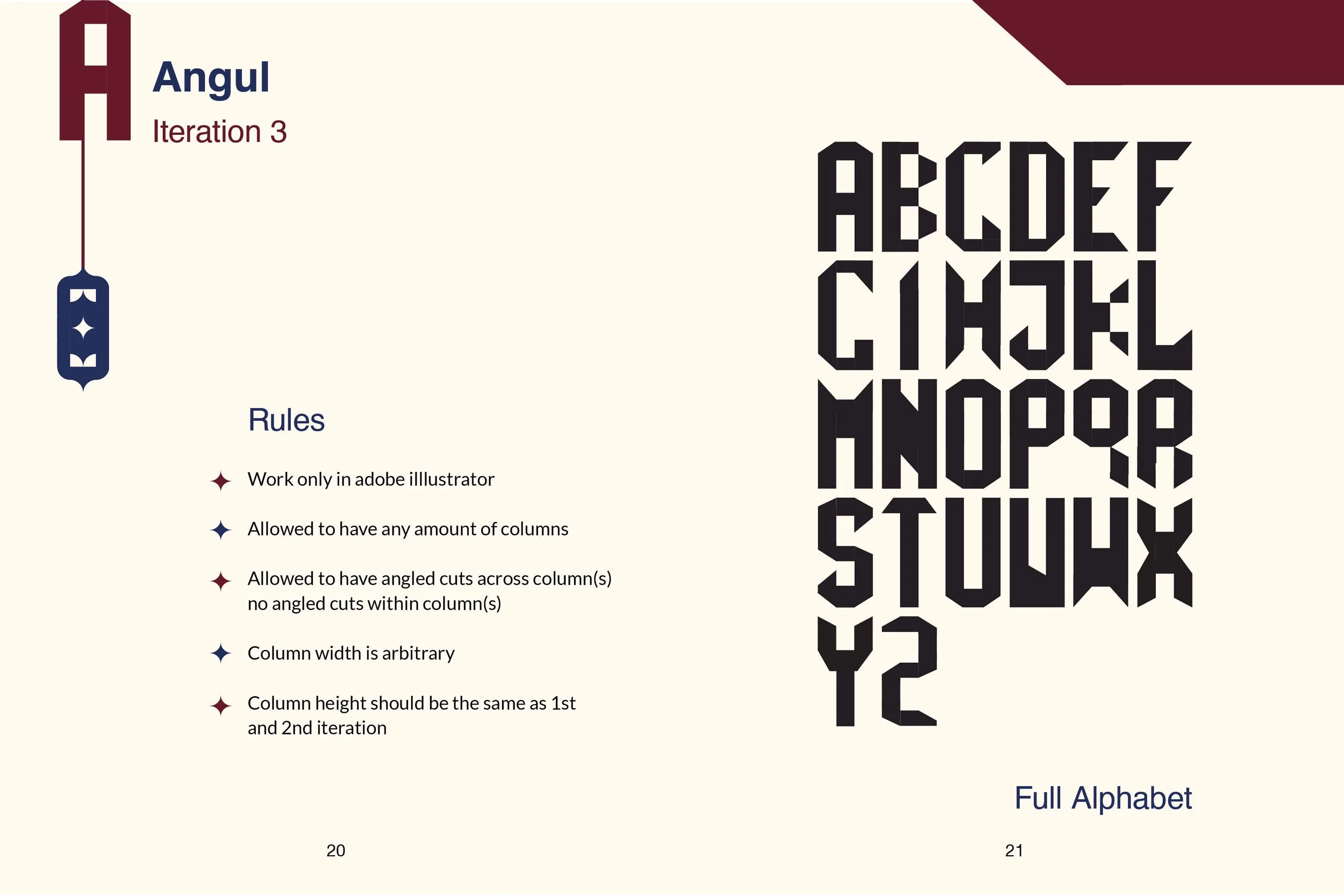


Concept: Incorporating angled cuts to add complexity and dynamism to the letterforms.
Outcomes: The introduction of angles created more dynamic and interesting letters, marking a significant evolution in design complexity.
ANGUL

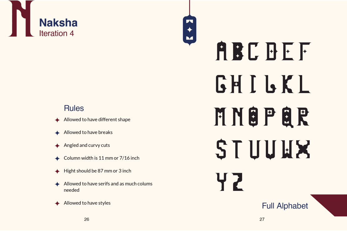


Concept: A decorative typeface with art deco influences, incorporating serifs and curvy cuts.
Outcomes: The typeface achieved a decorative aesthetic, emphasizing both form and detail.
NAKSHA


Concept: A 3D-styled typeface with isometric grid influences, evoking a futuristic feel.
Outcomes: The typeface effectively mimicked a 3D appearance without using actual 3D shapes, focusing on a futuristic aesthetic.
DIMEN UPPER
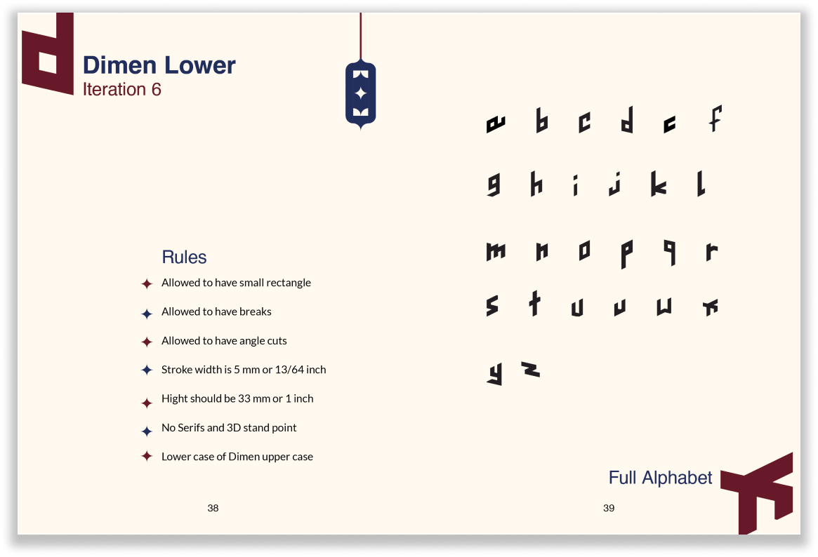


Concept: A lowercase version of Dimen Upper, adhering to similar design principles but including a median line to establish lowercase proportions.
Outcomes: This typeface maintained the 3D illusion while adapting the uppercase design into a more compact, lowercase form.