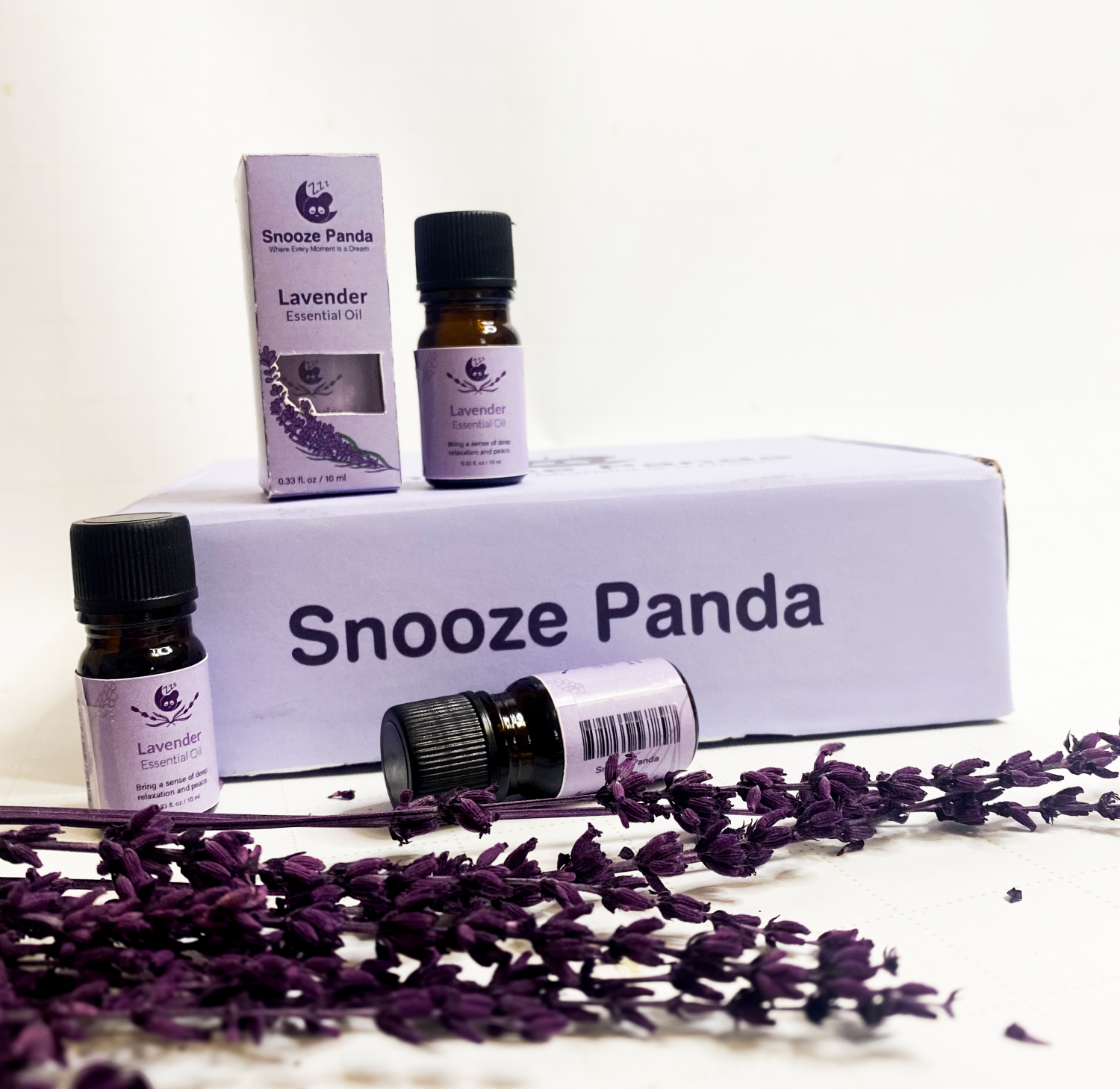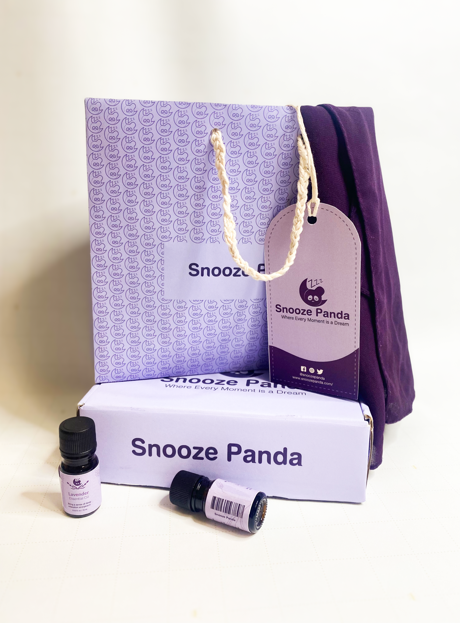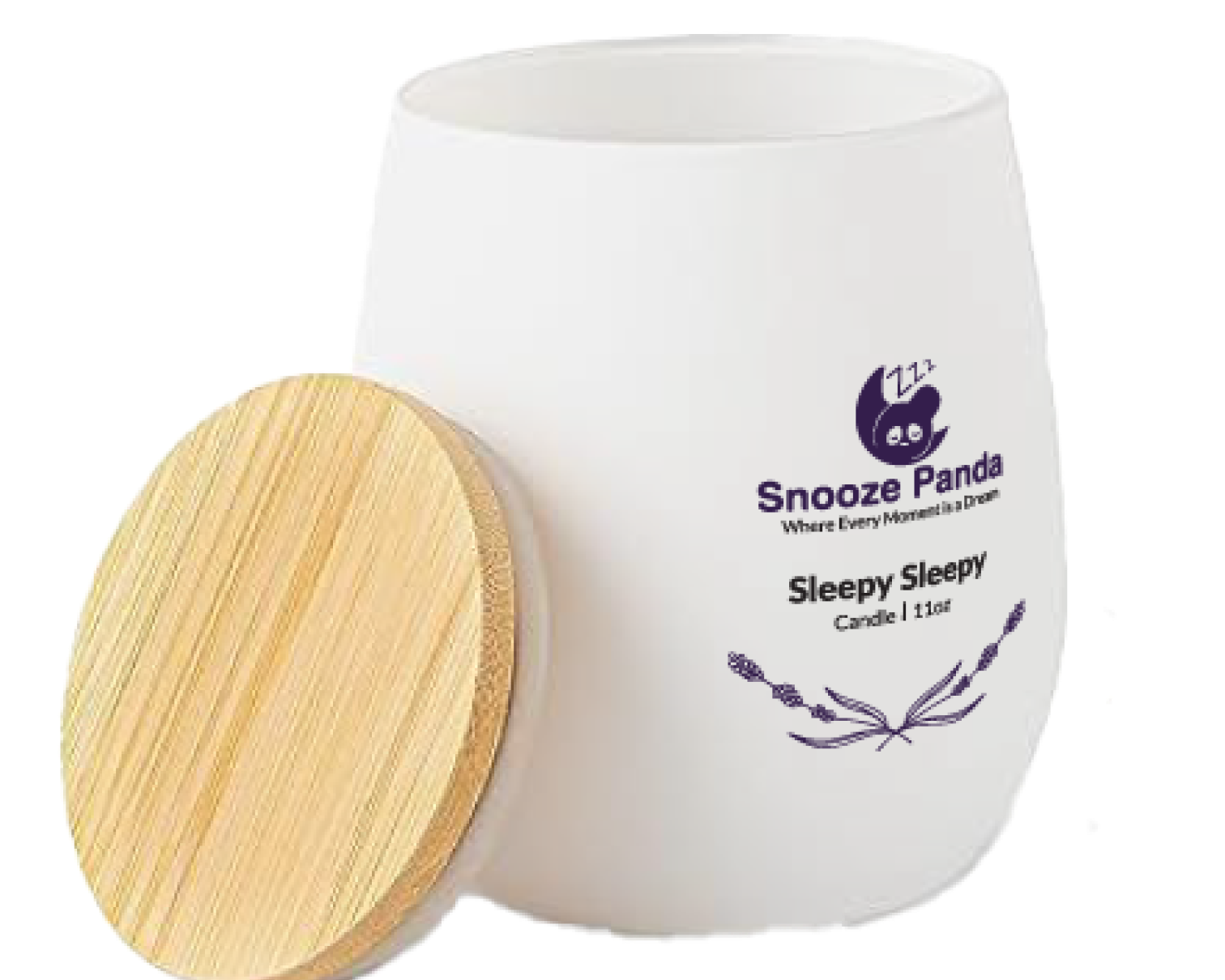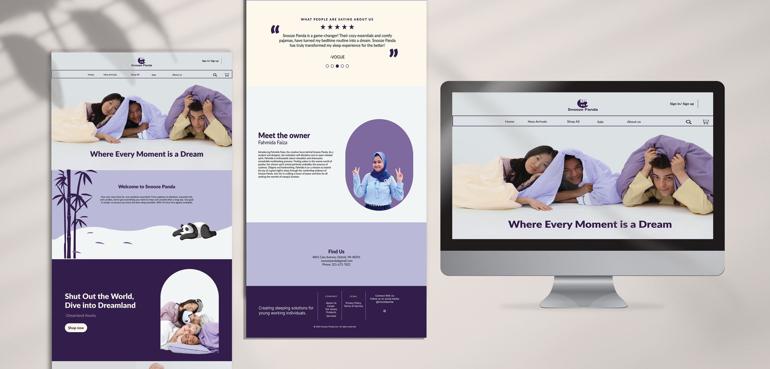


WHAT IS SNOOZE PANDA?
Snooze Panda promotes well-being through quality sleep products, crafted to create a peaceful environment for deep, restorative rest. Their range, from luxurious bedding to calming ambient lights, reduces stress and enhances relaxation, ensuring you wake up refreshed and ready to tackle the day. Their goal is to improve sleep quality for young professionals with calming, stress-relieving products designed for comfort, accessibility, and ease of use.
Enjoy the sleep you deserve with Snooze Panda.

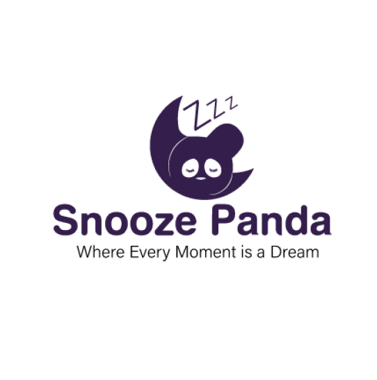
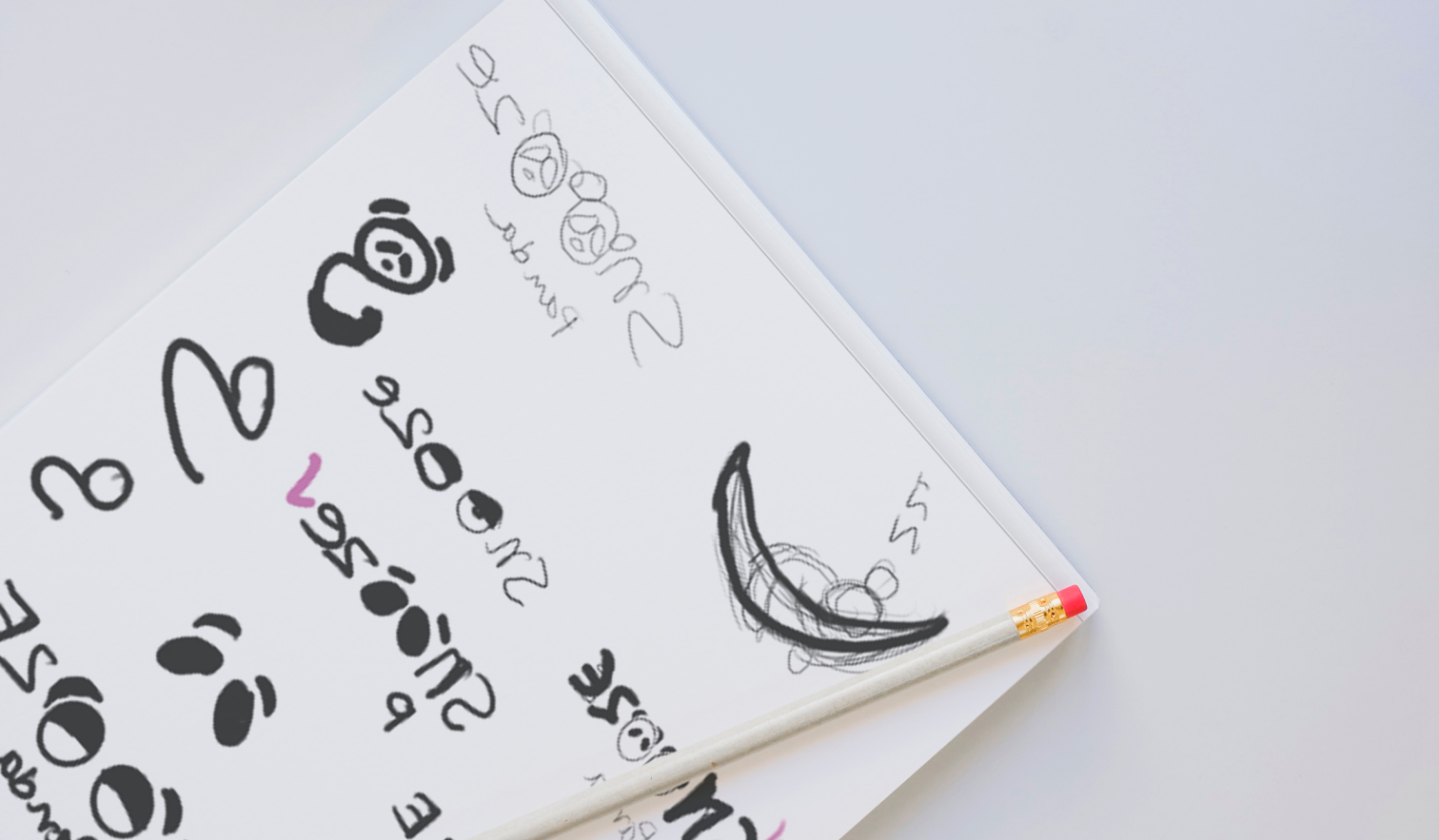
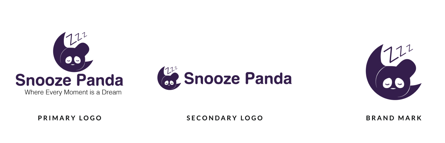
LOGO
For the Snooze Panda logo, I blended the moon and panda and the snooze sign Zzz to show that we’re all about sleep essentials. The moon represents nighttime and sleeping, while the panda is our brand symbol. I used our main font, Lato, but made it a bit rounder to match the panda’s style. This logo aims to capture what Snooze Panda is all about and connect with our customers. Snooze Panda has three logos, each serving a different purpose.
TYPOGRAPHY
I chose the sans-serif fonts Lato and Acumin Variable for their simplicity, readability, and modern appeal, which engage our audience and promote relaxation. For special brand elements, I selected the script font Modish, adding elegance and a distinctive touch to our visual identity.