Visual Analysis
Graphic Design I + Fall 2023 + VA
Over the course of the semester, I wrote and designed four visual analyses of works from design sources of my choice, ensuring that each selected work was an example of graphic design—such as a poster, logo, wayfinding system, or webpage structure—rather than art, like a painting or sculpture. These analyses were an opportunity to sharpen my visual perception, familiarize myself with design analysis, and connect my design thinking with my practice.
My objective was to understand why designs appear the way they do. To achieve this, I conducted thorough research and used concrete examples, moving beyond simple ideas or guesses to demonstrate an informed understanding of design concepts. For each analysis, I included my name and the analysis number, provided details such as the designer’s name, the title of the work, its source, and the date of publication, and wrote a half-page examination of the work. This examination covered the message being communicated, discussed how the visual qualities—like shapes, colors, textures, words, symbols, proportions, and type/image relationships—effectively convey that message and considered the cultural context influencing the design's appearance. To present my findings, I suitable formats such as movie posters, chocolate packages, eye drop packages, and book covers. For the Movie poster actually redo the illustration on my own way and used my info. As for other VA’s I have the same design but I used my research info in those packaging.
Visual Analysis
Poster Design
Book Jacket
Packaging Design
Research

VA 1
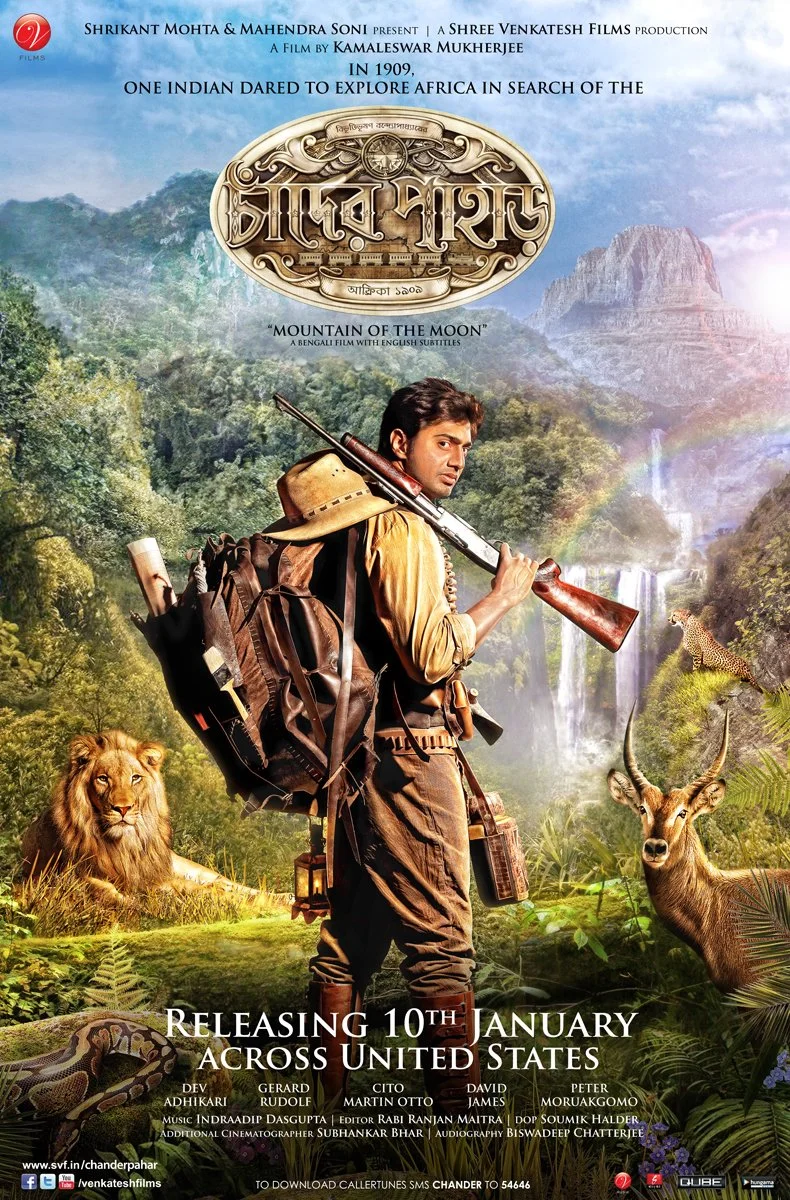
For First VA, I chose Bengali movie poster, and I decided to redo the illustration for the poster. My design for the movie poster for Chander Pahar tells us that a brave explorer named Shankar goes on an adventure in Africa in search of the “Mountain of the Moon” (Chander Pahar). The movie “Chander Pahar” is based on a popular Bengali novel set during the early 20th century. This poster’s design conveys both the historical and geographical context of the story. This movie didn’t have any official poster. They had lots of unofficial posters by graphic designers in early 2013. Most of the posters depicted Shankar as the hero in the foreground, and behind him, a challenging African landscape with jungles, deserts, and tall mountains in the background. On the poster, I like the colors because they convey the feeling of a wilderness, and the bold title font reflects the movie’s adventurous nature. The design reflects the setting of the movie, which portrays Uganda in 1910.
However, I do not think the poster Design and the title go together. Considering “Chander Pahar” (Mountain of the Moon) sounds like some fictional or unreal thing, I think it should have some sort of fictional feel. Additionally, the main theme was finding a special diamond mine called “Chander Pahar”. In my opinion, that should be the main focus, and then the actor. Although I get their point of view since the boy is the hero who is exploring, and since they want to attract the audience with the actor, that’s why their focal point is the actor, however, I still think the opposite should be done. The word “Chand” means moon and to me it gives an outer space or fictional feel to it, and I don’t see anything of that sort.

Orginal Poster
My Design
VA 2
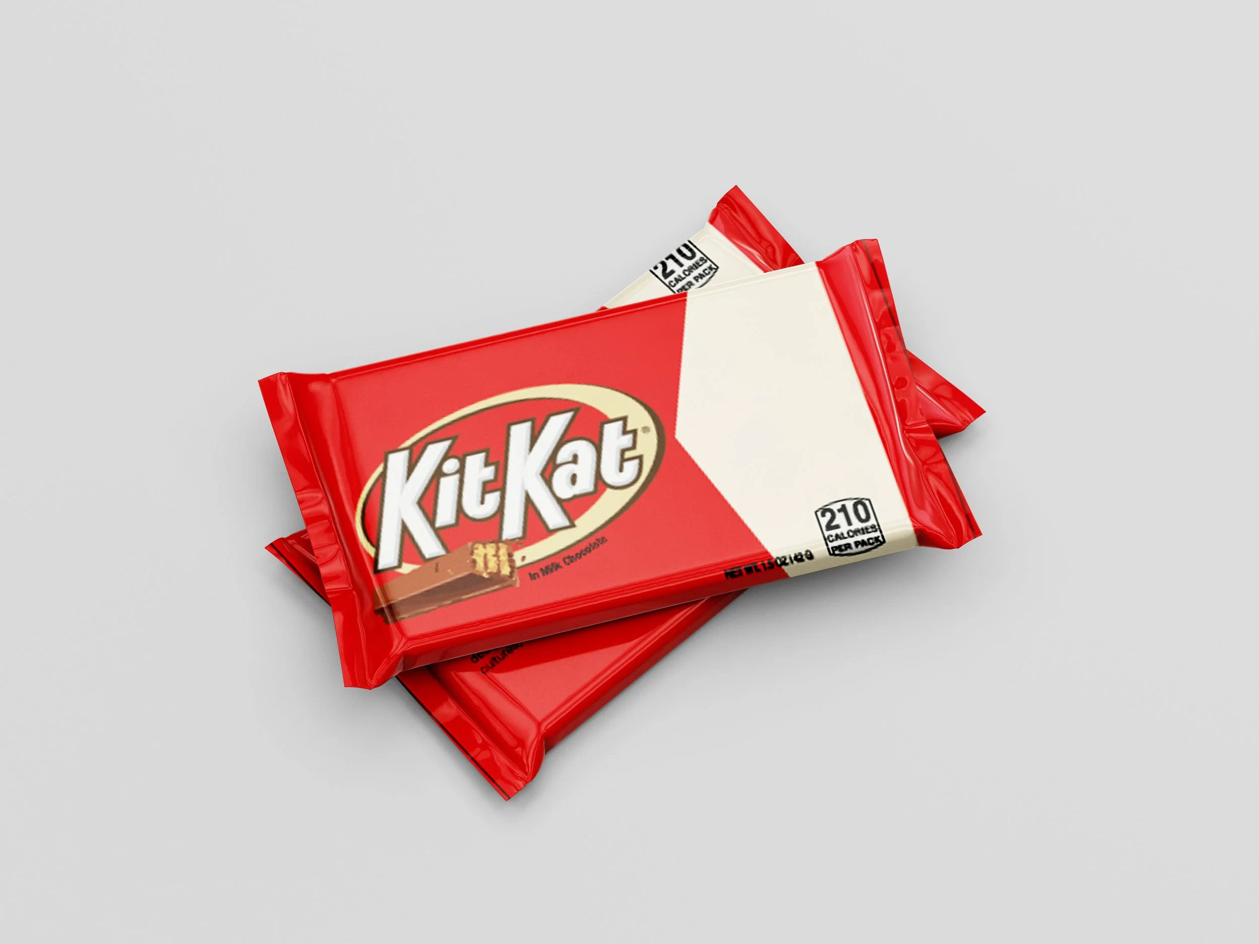
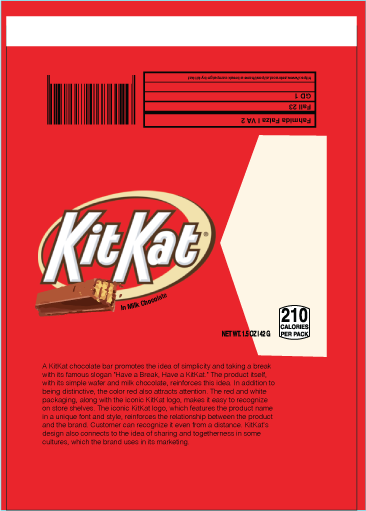
For the second VA, I choose the KitKat Chocolate Bar package. KitKat chocolate bar promotes the idea of simplicity and taking a break with its famous slogan "Have a Break, Have a KitKat." The product itself, with its simple wafer and milk chocolate, reinforces this idea. In addition to being distinctive, the color red also attracts attention. The red and white packaging, along with the iconic KitKat logo, makes it easy to recognize on store shelves. The iconic KitKat logo, which features the product name in a unique font and style, reinforces the relationship between the product and the brand. Customers can recognize it even from a distance. KitKat's design also connects to the idea of sharing and togetherness in some cultures, which the brand uses in its marketing.
However, I added my own twist by incorporating my personal information, replacing the original KitKat text while keeping the familiar style and format. This allowed me to maintain the brand's recognizable features while creating a unique version that represents my take on the design.

VA 3
For the third VA I choose Refreshing Eye Drop. The packaging for Refresh Tears eye drops communicates relief and comfort for dry eyes, and I believe the design achieves this through its effective use of color. The soft green, white, and sky blue tones, along with the water drop symbol, create a sense of soothing and freshness that aligns with the product’s purpose.
The choice of font on the packaging is clean and simple, making it easy to read and reflecting a straightforward, trustworthy nature. Even though the logo and some of the text use slightly curved fonts, they still convey a feeling of smoothness and comfort. This subtle design choice reinforces the product's calming and comforting qualities.
The relationship between the text and images is also crucial. The clear and harmonious integration of these elements ensures that the viewer quickly understands the product’s purpose. The green and sky blue tones especially work together to create a connection with nature, reinforcing the idea of a natural and refreshing experience. This color scheme is visually appealing and psychologically impactful, evoking feelings of refreshment, calmness, and relief—perfect for a product aimed at soothing the eyes.
Additionally, the water drop symbol is widely recognized and easily understood, making it an effective visual element. It clearly conveys the idea of hydration and refreshment, which is exactly what the product promises for dry, tired eyes. Overall, the design of the Refresh Tears packaging effectively communicates its message through thoughtful choices in color, font, and imagery.

VA 4
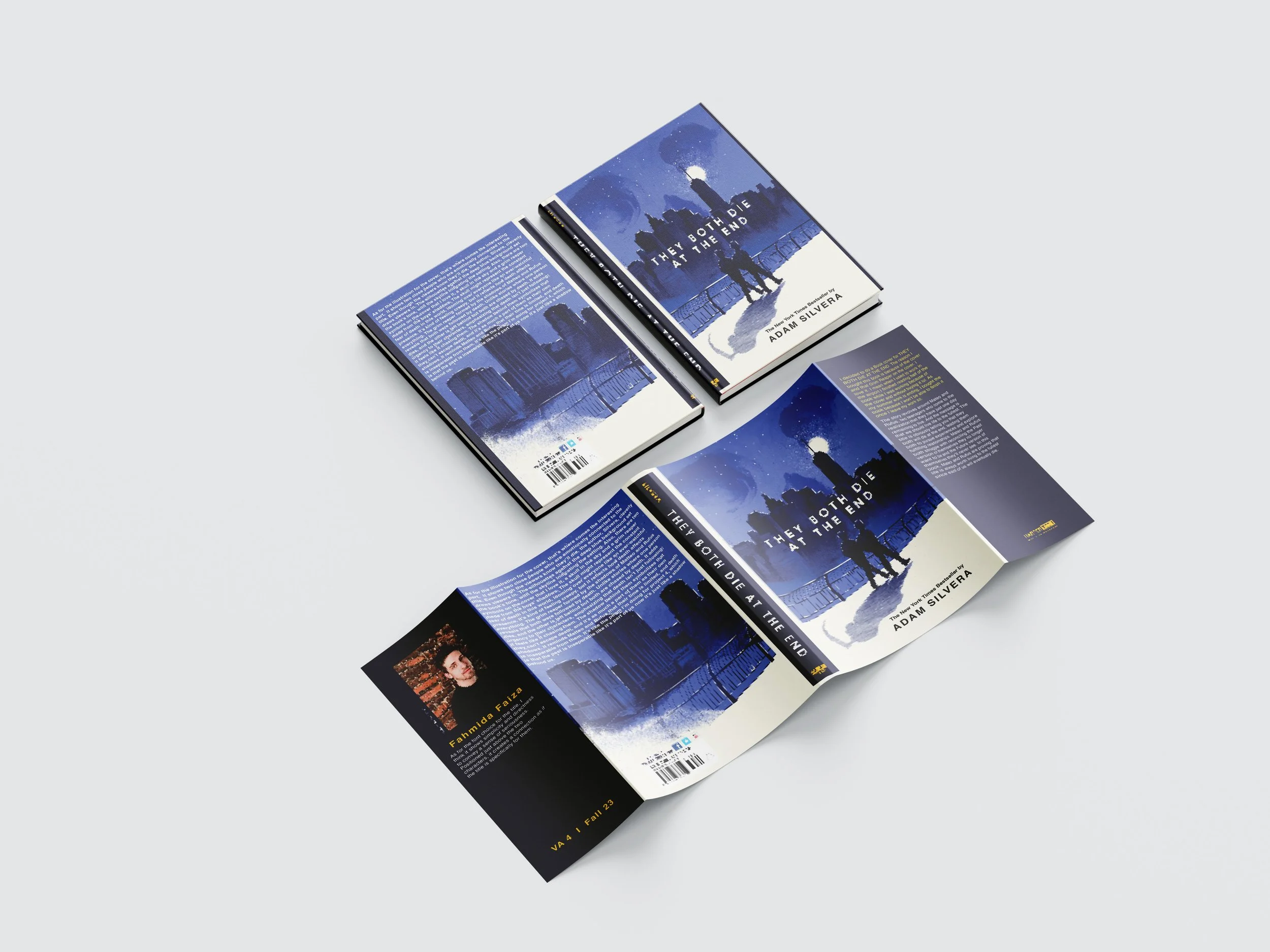
For the fourth VA, I decided to do a Book cover for THEY BOTH DIE AT THE END. The reason I bought this book is because of the cover and the fact that Grim Reaper is on the cover. I love it. I mean when I used to work in the airport I finished reading half of the book while I was working because of the cover and without buying it lol. As my summer work is ending, I bought the book because I won’t be able to finish it once I leave my work. The story revolves around Mateo and Rufus, two teenagers who come to the realization that they have just one day remaining to live. And the message is that we should live life to the fullest. The title is obviously telling you that they both will die at the end, leading them both to pursue experiences and explore fulfilling relationships. Mateo and Rufus both struggle with reconciling the Past version of themselves they no longer want to be and the Future version of themselves they’ll never see. In this book, Mateo and Rufus are proving that life is always worth living to the fullest since each of us will eventually die. As for the illustration for the cover, that’s where comes the interesting part. It shows two close people who are emotionally connected to the title. Even though the viewers know they’ll die, the author, Silvera, cleverly draws viewers in. The silhouettes against the deep blue background set the book’s tone, with the skyline indicating the setting. Also, there are two symbols on the cover that I love it, a skull in the sky and a grim reaper made from the boys’ shadows. The skull might represent the constant fear of death in this world, looming over everyone like an ever-watchful presence. It’s kind of feeling creepy, but it reflects how death affects everything. The grim reaper formed by the shadows of Matteo and Rufus reveals that both were followed by death. Unlike stories where one person dies, and the other is left behind but both are chased by death. It adds urgency to their characters, emphasizing that death isn’t just following; it feels like it chasing them. The shadow behind them symbolizes that they can’t escape death, and it’s as much a part of them as their own shadows. It reminds Matteo and Rufus that their time is limited, and death is inseparable from them. It’s like the poem I’m doing for project 4, which is that the past is inseparable like it’s part of us now it’s just like a shadow behind us. IAs for the font choice for the title, I think it shows simplicity and directness to convey a sense of seriousness. Positioned just above the two characters, it creates a connection as if the title is specifically for them.