Visual Analysis
Visual Analysis | Poster Design | Book Jacket | Packaging Design | Research

I created Five visual analyses of different graphic design pieces to learn more about other designs, like a movie poster, chocolate packaging, eye drop packaging, and a book cover. Each one was a chance for me to improve my observation skills, understand design choices better, and connect that knowledge to my own design work.
The goal was to figure out why these designs look the way they do. To do this, I did research and used clear examples to back up my thoughts, going beyond simple guesses. For each analysis, I included key information like the designer’s name, the title of the design, where it’s from, and when it was made. I also wrote a short review of each design, talking about the message it’s trying to communicate and how visual elements like shapes, colors, textures, words, and symbols help get that message across. I also thought about how cultural influences might have shaped the design.
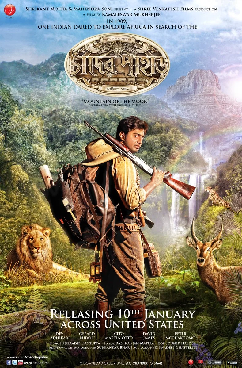
For my first visual analysis, I chose a Bengali movie poster for "Chander Pahar" and decided to redesign the illustration. My poster shows Shankar, a brave explorer, on an adventure in Africa searching for the “Mountain of the Moon” (Chander Pahar). The movie is based on a popular Bengali novel set in the early 20th century. The poster’s design reflects the historical and geographical setting of the story.
The original movie didn’t have an official poster, but several unofficial ones were created by graphic designers in early 2013. Most of these posters showed Shankar as the main figure with African landscapes of jungles, deserts, and tall mountains in the background. I liked the use of colors that capture the feeling of wilderness and the bold title font that reflects the adventurous tone of the movie. The design also highlights the setting of Uganda in 1910.
However, I feel the poster design and title don’t match. Since "Chander Pahar" (Mountain of the Moon) sounds fictional or mystical, I think the design should reflect that feeling. The main theme of the story is finding a special diamond mine called “Chander Pahar,” which, in my opinion, should be the main focus of the poster, not the actor. I understand the choice to highlight the actor as he’s the hero of the story, but I believe the poster should emphasize the mystery of the diamond mine. The word “Chand” means moon, which suggests something magical or otherworldly, but that feeling is missing from the orginal poster.

My Redesign Poster
The Orginal Poster
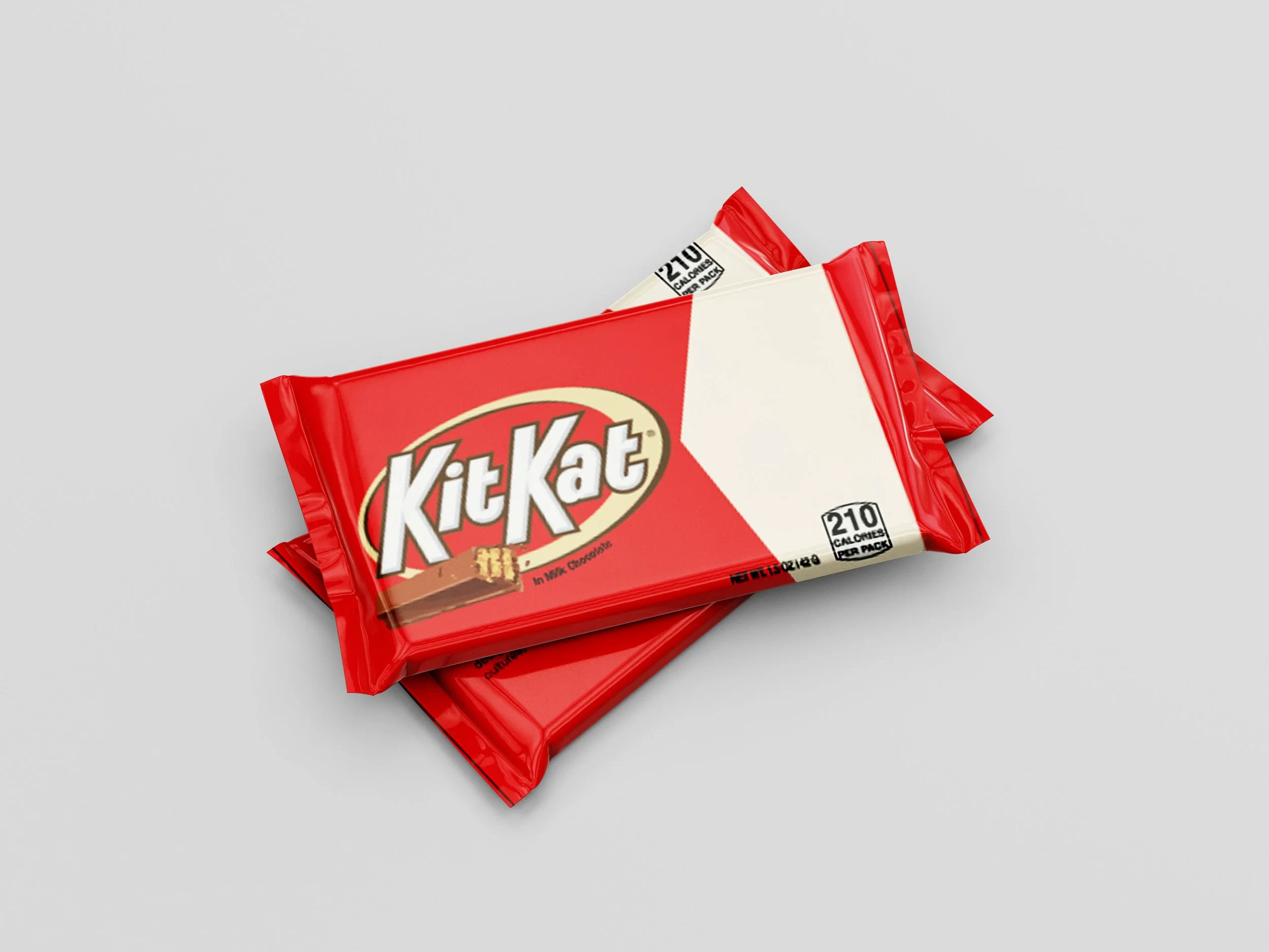
For my second visual analysis, I chose the KitKat chocolate bar package. KitKat promotes simplicity and taking a break with its famous slogan, "Have a Break, Have a KitKat." The product’s simple design, with its wafer and milk chocolate, supports this message. The bright red and white packaging, along with the iconic KitKat logo, makes it easy to spot on store shelves. The logo, with its unique font and style, creates a strong connection between the product and the brand, making it instantly recognizable even from a distance. The design also reflects the idea of sharing and togetherness in some cultures, which is a key part of KitKat’s marketing strategy.
For my version, I added a personal twist by incorporating my own information into the design. I replaced the original KitKat text while keeping the familiar style and format. This allowed me to keep the brand's recognizable look while creating a personalized version of the design.

For my third visual analysis, I chose the packaging for Refresh Tears eye drops. The design conveys relief and comfort using soft green, white, and blue tones along with a water drop symbol, evoking freshness. The clean, simple font reflects trustworthiness, while curved text adds a sense of smoothness. The layout’s clear balance helps viewers understand the product’s purpose. The water drop symbol reinforces hydration and refreshment, making the design effective in communicating the product’s message.

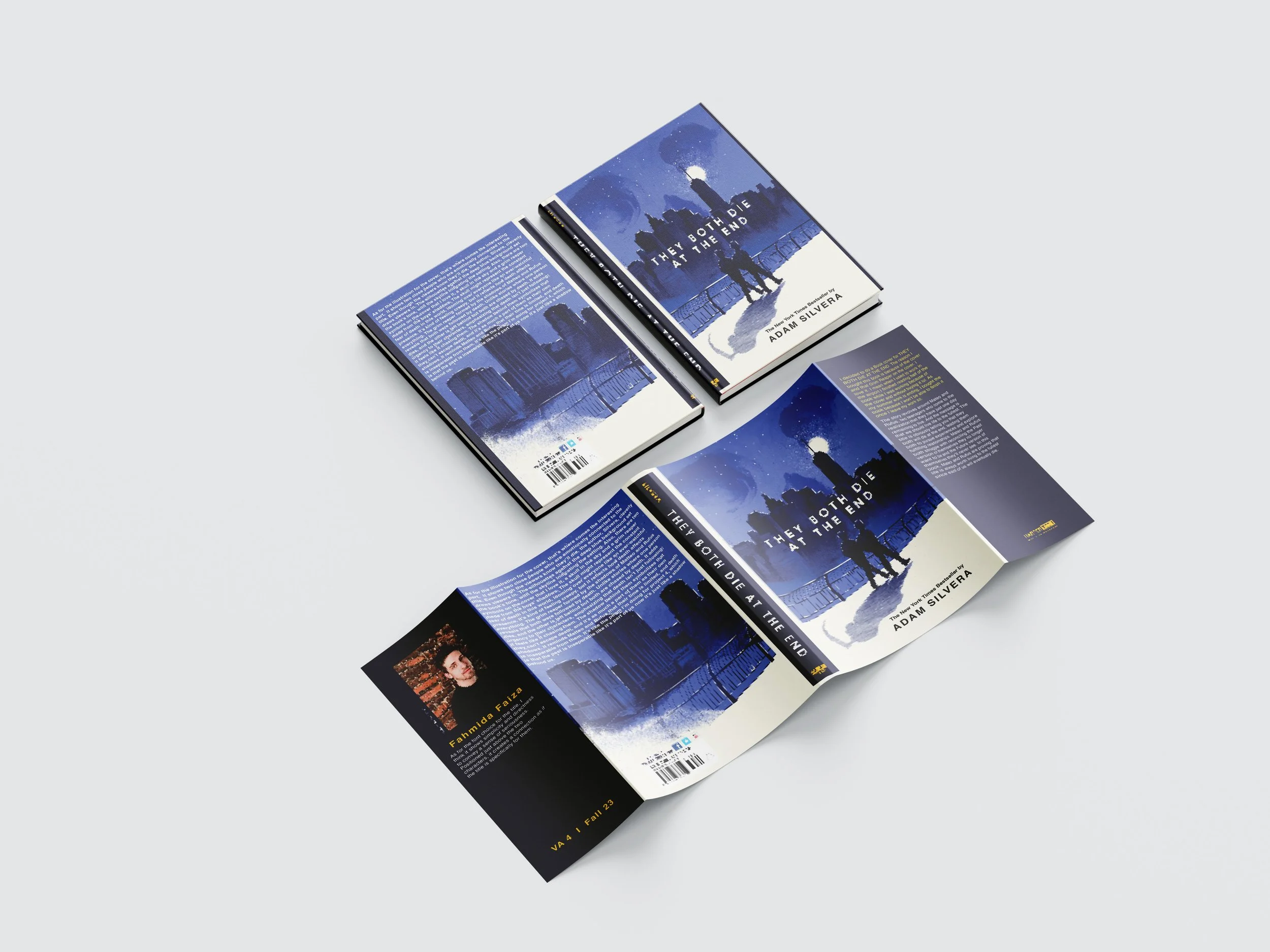
For my fourth visual analysis, I chose the book cover for "They Both Die at the End." I was drawn to it because of the Grim Reaper on the cover. While working at the airport, I read half of it without buying it, but later purchased it to finish.
The story follows Mateo and Rufus, two teenagers who have one day left to live. The message is to live life to the fullest. The cover’s illustration shows two figures walking together, symbolizing their emotional connection. The deep blue background sets a somber tone, while the skyline hints at the setting. Key symbols like the skull in the sky and a Grim Reaper formed by the boys’ shadows emphasize the constant presence of death. The skull represents the fear of death, while the Grim Reaper shadow shows death is chasing them both.
The font choice for the title is simple and direct, giving a serious tone. Positioned above the two characters, it creates a connection between the title and the characters’ journey.