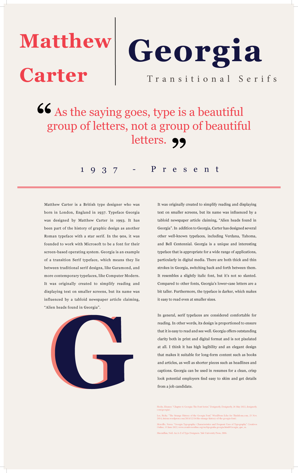
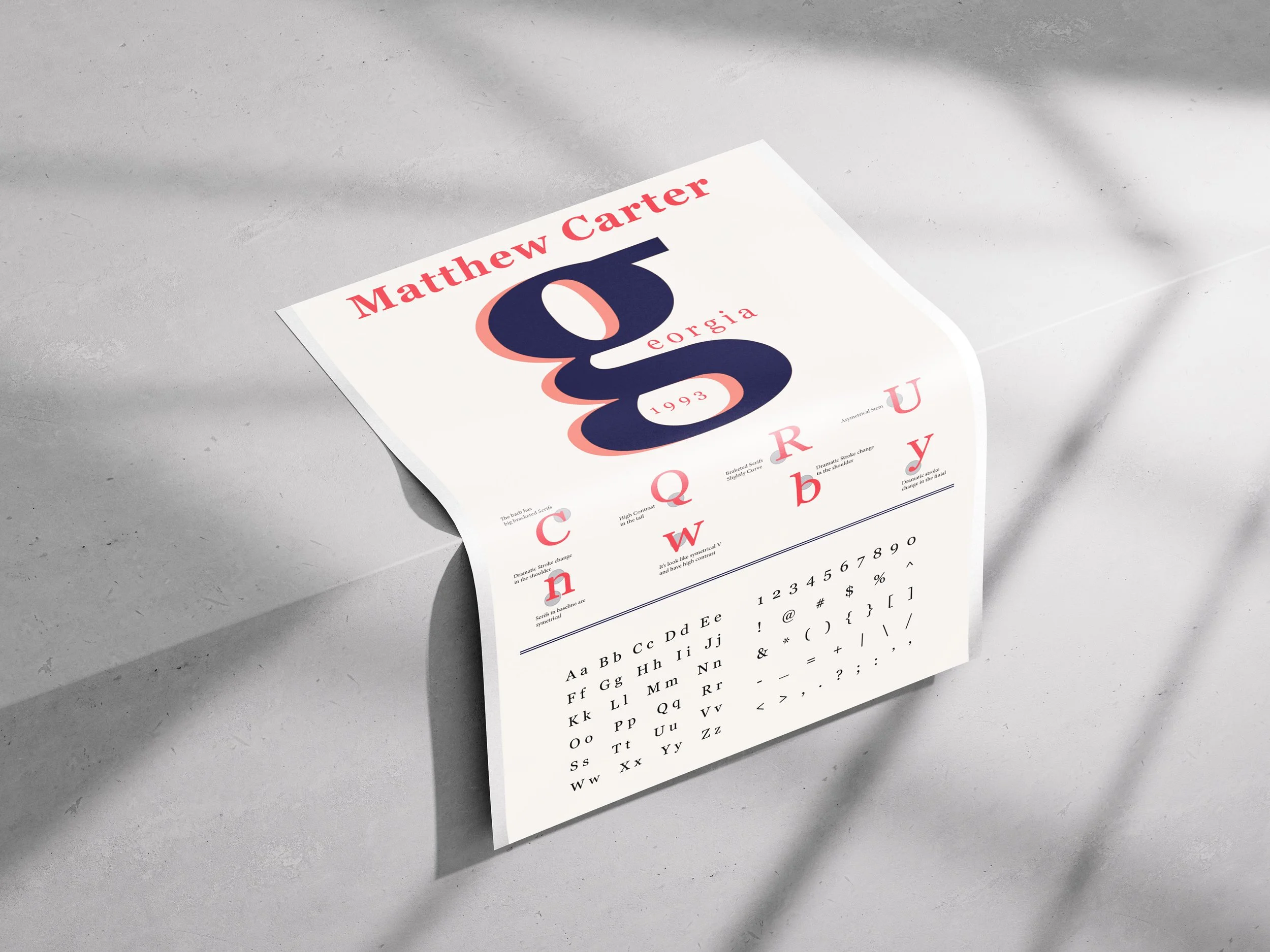
Georgia Typeface - M.Carter
I made two posters about the history of the Georgia typeface because I like how its timeless design bridges classic serif elegance with modern readability, making it versatile for both digital and print media. Georgia was designed by Matthew Carter, a British type designer, in 1993 for Microsoft to make text easier to read on screens. It's a typeface that combines old and new styles, with thick and thin strokes, slightly taller lowercase letters, and a darker look, which helps it stay clear even at small sizes. Its name comes from a tabloid headline, "Alien heads found in Georgia." I think Georgia is a versatile font that works well for both digital and print, making it great for things like books and resumes.